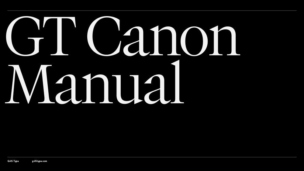
GT Canon

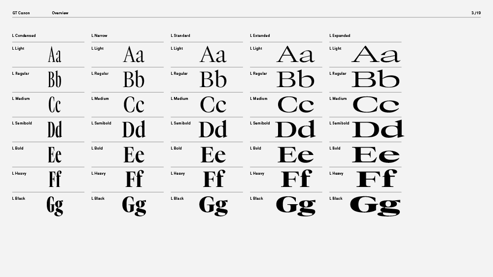
Family overview
- Condensed
- S Light Italic
- M Light Italic
- L Light Italic
- S Regular Italic
- M Regular Italic
- L Regular Italic
- S Medium Italic
- M Medium Italic
- L Medium Italic
- S Semibold Italic
- M Semibold Italic
- L Semibold Italic
- S Bold Italic
- M Bold Italic
- L Bold Italic
- S Heavy Italic
- M Heavy Italic
- L Heavy Italic
- S Black Italic
- M Black Italic
- L Black Italic
- Narrow
- S Light Italic
- M Light Italic
- L Light Italic
- S Regular Italic
- M Regular Italic
- L Regular Italic
- S Medium Italic
- M Medium Italic
- L Medium Italic
- S Semibold Italic
- M Semibold Italic
- L Semibold Italic
- S Bold Italic
- M Bold Italic
- L Bold Italic
- S Heavy Italic
- M Heavy Italic
- L Heavy Italic
- S Black Italic
- M Black Italic
- L Black Italic
- Standard
- S Light Italic
- M Light Italic
- L Light Italic
- S Regular Italic
- M Regular Italic
- L Regular Italic
- S Medium Italic
- M Medium Italic
- L Medium Italic
- S Semibold Italic
- M Semibold Italic
- L Semibold Italic
- S Bold Italic
- M Bold Italic
- L Bold Italic
- S Heavy Italic
- M Heavy Italic
- L Heavy Italic
- S Black Italic
- M Black Italic
- L Black Italic
- Extended
- S Light Italic
- M Light Italic
- L Light Italic
- S Regular Italic
- M Regular Italic
- L Regular Italic
- S Medium Italic
- M Medium Italic
- L Medium Italic
- S Semibold Italic
- M Semibold Italic
- L Semibold Italic
- S Bold Italic
- M Bold Italic
- L Bold Italic
- S Heavy Italic
- M Heavy Italic
- L Heavy Italic
- S Black Italic
- M Black Italic
- L Black Italic
- Expanded
- Mono
- Light Italic
- Regular Italic
- Medium Italic
- Semibold Italic
- Bold Italic
- Heavy Italic
- Black Italic
Subfamilies
- Standard S LightDisplay denotes a style made for large sizes: headlines, titles, posters. Display styles often stress features: thinner hairlines, sharper serifs, higher contrast, narrower spacing. They prioritise impact over long, continuous readability.
- Standard M LightWhen quoting, words do not necessarily have to change, and yet most things do alter. Typeface, layout, screen, print technology, paper, context, means of distribution. Quoting always raises the question of origin and our relationship to it. What is it that we change when we quote?
- Standard L LightBalance is not symmetry. It is the tension between collapse and coherence. Therefore, it is the opposite of stillness. To speak of balance is to invoke the condition of something being held and not to be fixed. No conclusion but an ongoing relation.
- Standard S Light ItalicAn instance is a moment made material. It is the singular occurrence of a state that could have been otherwise. By virtue of this contingency, an instance is in turn also moment-creating: an instance is not only the capturing of time (including processes and patterns) or space (including organisational and hierarchical positions), but also their trigger.
- Standard M Light ItalicNodes mark the transition into the technical age by how they turn form into data. Designers and engineers already thought in terms of measurements, geometry, and even coordinate-like reasoning long before the use of computers.
- Standard L Light ItalicA face embodies character: the severity of a brutalist façade, the lightness of thin display cut, the friendliness of rounded terminals. The face is also about recognition: we know a style by its face, we choose an object because of the impression it projects.
- Standard S RegularThis circumstance informs all aspects of the typeface design, from the architecture of the letters and the design of individual forms and components, to optical corrections (overshoot). Gravity manifests in stroke and proportion. The thickening of verticals, the grounding of serifs, the way curves rest against the baseline—all contribute to how a letter *sits *or stands..
- Standard M RegularDisplay denotes a style made for large sizes: headlines, titles, posters. Display styles often stress features: thinner hairlines, sharper serifs, higher contrast, narrower spacing. They prioritise impact over long, continuous readability.
- Standard L RegularThis circumstance informs all aspects of the typeface design, from the architecture of the letters and the design of individual forms and components, to optical corrections (overshoot). Gravity manifests in stroke and proportion. The thickening of verticals, the grounding of serifs, the way curves rest against the baseline—all contribute to how a letter *sits *or stands..
- Standard S Regular ItalicTools supporting interaction design. At the same time, we can observe a trend towards reduced interaction surfaces. Users increasingly ask than navigate. Which increasingly reduces the area of contact.
- Standard M Regular ItalicAn instance is a moment made material. It is the singular occurrence of a state that could have been otherwise. By virtue of this contingency, an instance is in turn also moment-creating: an instance is not only the capturing of time (including processes and patterns) or space (including organisational and hierarchical positions), but also their trigger.
- Standard L Regular ItalicTools supporting interaction design. At the same time, we can observe a trend towards reduced interaction surfaces. Users increasingly ask than navigate. Which increasingly reduces the area of contact.
- Standard S MediumUncle Henry never laughed. He worked hard from morning till night and did not know what joy was. He was gray also, from his long beard to his rough boots, and he looked stern and solemn, and rarely spoke.
- Standard M MediumAnd yet, justification can mean a speech act of rare agency, inhabited with a groundless sorrow over the circumstances that necessitate it. Things should have been the other way around. From the start.
- Standard L MediumThe reason, therefore, that some intuitive minds are not mathematical is that they cannot at all turn their attention to the principles of mathematics. But the reason that mathematicians are not intuitive is that they do not see what is before them, and that, accustomed to the exact and plain principles of mathematics, and not reasoning till they have well inspected and arranged their principles, they are lost in matters of intuition where the principles do not allow of such arrangement.
- Standard S Medium ItalicThis circumstance informs all aspects of the typeface design, from the architecture of the letters and the design of individual forms and components, to optical corrections (overshoot). Gravity manifests in stroke and proportion. The thickening of verticals, the grounding of serifs, the way curves rest against the baseline—all contribute to how a letter *sits *or stands..
- Standard M Medium ItalicMoving a vector between applications can result in measurable shifts caused by floating-point limitations and incompatible Bézier implementations. In typography, the discrepancy is heightened: glyph outlines include instructions (hinting) that govern their behaviour at specific sizes, which are lost when text is converted to outlines. Thus, even in fields predicated on precision, scale introduces qualitative change not as an exception but as a structural condition.
- Standard L Medium ItalicOnly that is limited can invite, can expand and intrude, or be intruded upon. No boundaries, nothing to transcend? At least nowhere to stay. Wandering does not leave any traces as long as it keeps up with the wandering of time.
- Standard S SemiboldTension as a whole does not arise from the unrestrained or untamed wildness of individual elements. On the contrary, it is the right balance of unity and discipline on the one hand, and deviation on the other. In political and social contexts, the dissolution of tension is a noble and worthy pursuit. In design, it all too often leads to illegibility. This applies in both directions. After all, what is attraction, what is eroticism? The casual display of the fully revealed whole, or the play of gradually unveiling its parts? No tension, no relation.
- Standard M SemiboldIn the war of Troy, the Greeks having sacked some of the neighbouring towns, and taken from thence two beautiful captives, Chryseïs and Briseïs, allotted the first to Agamemnon, and the last to Achilles.
- Standard L SemiboldBut I can inform myself. I can learn about the environment and people I create for. Their past and present. Their needs and desires. We are not what we design and it would be foolish to believe that we know our so called target group as well as we know our flatmates.
- Standard S Semibold ItalicWe meet in blurriness. If we understood each other completely, we would be identical and weightless, dissolving into pure oneness. Until that happens, however, recognising our differences and contrasts helps us to come closer together.
- Standard M Semibold ItalicWhat are the consequences? On the one hand, the design of the self. The device-ification of our bodies does not begin with chip implants, artificial intelligence and the semi-automation of intellectual work, but earlier and more decisively through this very intertwining of design and the various modes of supposed self-discovery.
- Standard L Semibold ItalicBalance resides in contrast: between forms, weights, tones, tensions. It is noticed before it is seen, known before it is measured. A poster calming your eye without quieting it, a painting’s tension resolves in stillness. Balance is never imposed.
- Standard S BoldIf my limited knowledge of physics, gained from school lessons long time ago, has enabled me to understand the theorists of general relativity correctly, the motion of our planets around the sun is only apparently circular, but rather a kind of straight line.
- Standard M BoldWhat are we but areas that move between areas, perceiving areas, dividing areas, with the help of areas, into more areas? Lines, on the other hand, lead a ghostly existence: in their terrible conspicuousness, they are omnipresent and yet we cannot perceive them.
- Standard L BoldBoth arise in a mutual interplay. Although drawing has never been just a medium of representation, but always also one of operation, one that forces the model into a certain order (line, proportion, grid, materiality), the introduction of nodes has given this reciprocal relationship a significant influence on authorship, insofar as it shifts slightly ‘in favour’ of the model: digital drawing can no longer not be a model, and from now on, the designer can no longer purely be a drawer but is always also a model-builder. Nodes allow form to be computed.
- Standard S Bold ItalicWandering does not leave any traces as long as it keeps up with the wandering of time. Edges mark the threshold of meaning, the moment when sense meets its outside of the inside of the outside of the sentence. And therefore all is exterior.
- Standard M Bold ItalicAnatomy is the gesture of dividing the visible to seek what cannot be seen. Anatomy is the scientific study of the structure of living organisms.
- Standard L Bold ItalicLetterforms were constructed, architectural drawings relied on projection, mechanical parts were dimensioned with astonishing precision. But as these constructions were “analogue”, they remained continuous. Enter the node: Forms are now discrete, shapes are a list of coordinates and continuity is produced by computational smoothing.
- Standard S HeavyAnd also nodes are often defined more by their context than by their very coordinates. As junctions, connecting points or simply as a basic unit they fundamentally define the structure of data, the architecture of shapes.
- Standard M HeavyIt is one of the oldest branches of biological science, with its origins lying in early human attempts to understand the body by cutting it open, drawing it and naming its parts.
- Standard L HeavyIt emerges through attention and waiver. Balance is not the absence of friction, but its distribution. Balance follows form, forms form, follows content, content which is shaping form, form flowing into form, unintentionally intentional.
- Standard S Heavy ItalicBalance resides in contrast: between forms, weights, tones, tensions. It is noticed before it is seen, known before it is measured. A poster calming your eye without quieting it, a painting’s tension resolves in stillness. Balance is never imposed.
- Standard M Heavy ItalicEdges mark the threshold of meaning, the moment when sense meets its outside of the inside of the outside of the sentence. And therefore all is exterior.
- Standard L Heavy ItalicAccordingly, texts are often described as linear, even though, in most cases, this linearity is erratic or even fractal (with eye movements consisting of saccades). Any attempts to escape this linearity usually result in the lines becoming fragmented into more lines, except in the case of one-word readers, where the reading movement is directed towards a single word.
- Standard S BlackA face is presence. It looks back, even when it does not see. The face is exposure, vulnerability, recognition: it is how we appear to others, how we are held in relation. It is therefore always recognition and exemplification. Individual and collective.
- Standard M BlackBring into view, make present, display. A display is not just what is shown but the act of showing itself. To make something appear as something. Since we not only see what is visible but the amorphous, fractioned mass of the invisible, that underlies it, overshadows it, precedes it and lingers on.
- Standard L BlackSince design means composing contrasts, creating tension can be a consequence. It’s not inevitable though. Contrast is no guarantee that tension will emerge. Quite the opposite. Tension is a rare commodity. Too much,and it dissipates. Often, the sweet spot lies in drawing the bow just far enough that it does not break.
- Standard S Black ItalicA cock was once strutting up and down the farmyard among the hens when suddenly he espied something shinning amid the straw. “Ho! ho!” quoth he, “that’s for me,” and soon rooted it out from beneath the straw.
- Standard M Black ItalicIf one geometrises gravity—which is said to be at the heart of the relativisation of space and time—it is the most direct possible movement of these bodies around the sun. Like the apple that falls from Newton’s tree, gravity does not distract it from its actual ideal—to float strangely and ghostly in the air or on the tree?
- Standard L Black ItalicTools supporting interaction design. At the same time, we can observe a trend towards reduced interaction surfaces. Users increasingly ask than navigate. Which increasingly reduces the area of contact.
- Settings
Typeface information
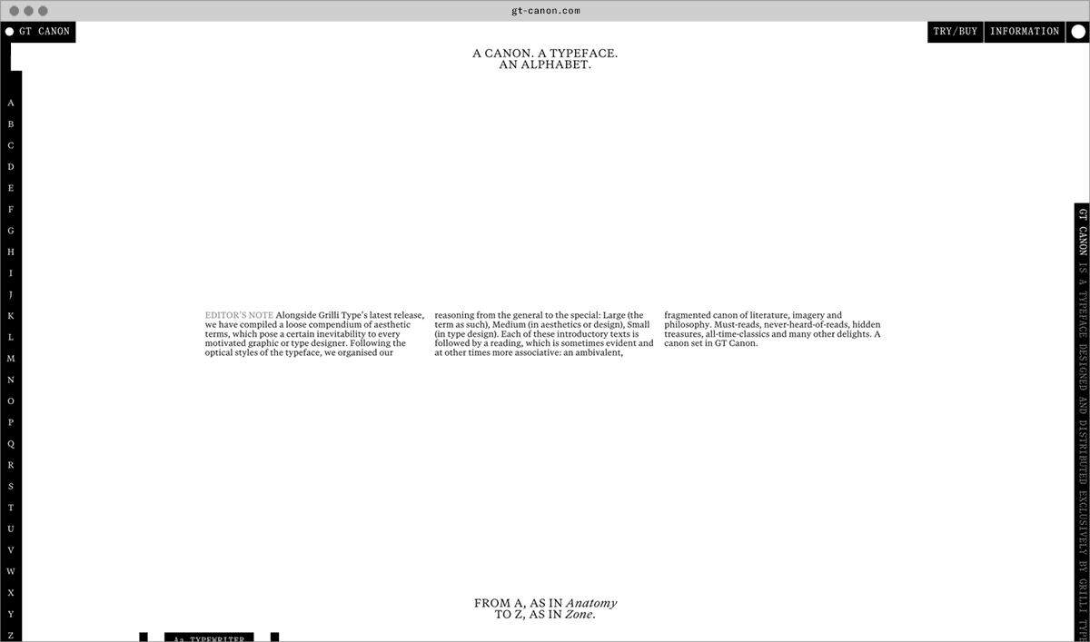
GT Canon’s design is pragmatic but not static: movement and liveliness are embedded in the letterforms. It is our answer to what our digital times require of a serif today. It’s what a contemporary serif should be in both form and function. Like its sans serif sibling, GT Standard, it aims for modern functionality rather than stylistic reinvention.
- Designed by Grilli Type
- Released in 2026
- Available in 224 styles
- GT Canon is available for customization and language extensions
- Download the free trial fonts
Typeface features
OpenType features enable smart typography. You can use these features in most Desktop applications, on the web, and in your mobile apps. Each typeface contains different features. Below are the most important features included in GT Canon’s fonts:
- TNUM
- Tabular figures
0123456789
- ONUM
- Oldstyle figures
0123456789
- SMCP
- Small Caps
Anatomy
Typeface Minisite
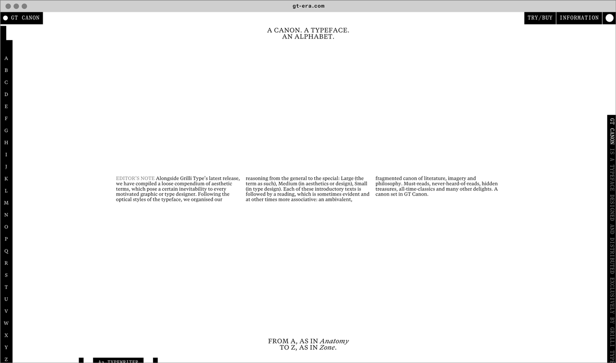
- Visit the GT Canon minisite to discover more about the typeface family’s history and design concept.
GT Canon in use